Showing posts with label Clock. Show all posts

Monday, November 7, 2022

Amazing Paper Grace November Die of the Month: Pop Up 3D Vignette Alarm Clock

Welcome to my creative space!

As soon as I saw this fabulous Amazing Paper Grace Pop Up 3D Vignette Alarm Clock November Die of the Month, I just knew I wanted to create a patina finish to give a vintage feel to this amazing design.

These cards show patina two ways. The 3D vignette card uses mixed media products to create the patina. I explain this process below in the Tips and Techniques section. On the flat card I used patina printed paper to show you a quick and easy way to get this effect with just paper. While they look very similar in this photo, the metallic finishes truly look like old patina copper.

I'm always looking for ways to create masculine cards for the special men in my life and either of these cards could be used for a guy. The flat card even has a touch of steampunk with the black gears tucked behind the clock.

Please scroll down through the Tips and Techniques section to find close-ups and all the details on how to create these two vintage clock cards.

Many thanks to Amazing Paper Grace for providing the dies used in this project!

There are 21 cutting dies included in the Pop Up 3D Vignette Alarm Clock.

Pop Up 3D Vignette Alarm Clock

Flat Steampunk Card

Tips and Techniques
To create the patina effect, I started with a lightly patterned teal paper and rubbed Salvaged Patina Distress Oxide Ink randomly over the die cut paper, I went back and added a few touches of Uncharted Mariner Distress Oxide Ink. I then spritzed the inked paper with a fine mist of water to activate the oxide inks. Once dry to the touch, randomly rub Finnabair Copper Metallique Wax over the surface. Then go back and repeat the oxide ink process with the same colors so the oxide looks like it's coming out of the copper from years of oxidation.

Pieces that are "oxidized" include the scrolled clock frame, center decorative piece, ring with minute marks, alarm bells, hammers, sentiment strip and base.

The clock hands are cut from metallic copper cardstock and rubbed with the oxide inks. They are held in place with a mini brad which is colored with more of the copper wax. 

The number ring and backing for the center scrolled piece are cut from black metallic cardstock. The cream paper backing the entire design is a grungy masculine printed paper. This paper has touches of teal in it that works so perfectly with the patina finish.

This close-up of the bells shows the shimmering copper blended with the patina finish. It truly does look like old metal.  

The center scrolled piece backed in black is popped up with thin foam squares to give dimension and so that the clock hands will be raised up above the number ring. 

This fabulous 3D card folds flat for mailing. 
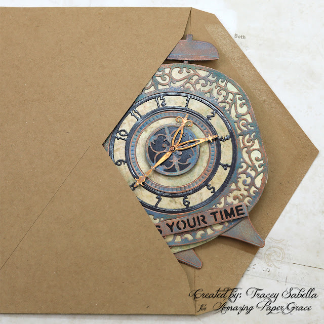
And tucks right into an envelope.

This card is cut from patina printed paper for a similar feel. If you don't have the mixed media products needed and want a quicker card, this is a great way to go. 

The background paper and gears give this card a more masculine industrial steampunk feel for that special guy in your life. The focal paper is inked with Pumice Stone Distress Ink to add to the vintage vibe. I wanted to keep this card simple, so didn't do any other inking. 

The card frame layer is cut from the same patina paper used to cut the clock design. 

The number circle and center background piece are cut from regular black cardstock and the clock hands from the same metallique copper paper used on the 3D card. I found this sentiment in the Idea-ology Small Talk pack that works so perfectly with the clock image. 

The cream clock base is the same paper used for the 3D clock card. 

These chipboard gears are heat embossed with black embossing powder for a rustic industrial feel. The clock image is popped up with foam tape so that the gears can be tucked underneath.

Below you can find the products I used to create this project including some with compensated affiliate links to Scrapbook.com and Spellbinders. These links are at absolutely no cost to you. When you shop through the links below, I receive a small commission from the companies.  These commissions help me cover the costs of my blog and other expenses, which allows me to continue to provide you with FREE inspiration along with detailed Tips and Techniques provided for every project. Thank you so much for your love and support!

Amazing Paper Grace Sets:

Paper:

Ink:

Mixed Media:

Embellishments:
  • Idea-ology - Tim Holtz - Mini Fasteners
  • Idea-ology - Tim Holtz - Small Talk
  • Stash - Chipboard Gears

Adhesives:

Tools:

The Amazing Paper Grace Die of the Month is available exclusively at Spellbinders Paper Arts during November 2022, Pop Up 3D Vignette Alarm Clock along with other membership perks.

View this month’s Amazing Paper Grace Die of the Month!

Thanks so much for stopping by to view this patina alarm clock ensemble. I hope you've been inspired.

Saturday, November 24, 2012

Christmas Morning - The Scrapping Stamper/Bo Bunny

Today, I'm sharing a Christmas layout with photos going back about 15 years. At that time we lived in North Carolina and made a trip Ohio to spend the holidays with our families. This is Elizabeth who was married in October and Maria who just turned 18 yesterday. Happy birthday, Maria!! I created this page with inspiration from Shannon, The Scrapping Stamper's, beautiful November sketch. If you are in the mood for Christmas and winter layouts be sure to return Friday for the ScrapThat! December Reveal and Blog Hop. 

"Christmas Morning"

Shannon's delightful November Sketch:

Stop by The Scrapping Stamper to see the other inspiring pages created by Shannon's Design Team. 

I won the Mistletoe Collection from Bo Bunny last month. Such sweet cheerful paper, but not my normal style/color pallet. I was determined to created a layout featuring this fun line and combined some inking, punching and fussy cutting to create this page. I couldn't resist cutting out the oh so sweet little quirky, crooked tree and presents which were so perfect for these Christmas morning shots of our girls. I'm entering this page in the November Bo Bunny Layout Challenge to use two separate clusters, each containing a photo. If you aren't familiar with the fun Mistletoe line, here is a shot of the collection pack:
Tips and Techniques:


Layering ~ I fussy cut strips of the green hexagon print, and punched strips of blue and red to layer with doilies and lace to create the background. 

Hand Crafted Fabric Flowers ~ I made the cream fabric flowers a while back when our local craft store demoed the Clover Kanzashi Flower Maker Templates. I spend some crop time creating them, and they've been sitting in my stash until now. I played with several of the templates, but the Pointed Flower template seemed the the best suited for scrapbook flowers. They were quite quick and easy to create. 

Found Objects ~ I recently found a bag of vintage buttons at a thrift store for a mere $2. Most of the buttons you see tucked into my clusters came from that bag of goodness. Don't you just adore the blue flower button next to the cream flower? 

Transparencies ~ I fussy cut my photos to fit the transparencies and hid little bits of red-lined tape under the printed edge to adhere the photos to the transparencies. 

Fussy Cutting ~ I fussy cut the Christmas tree and presents. The gifts were raised with different thicknesses of pop dots and strips for dimension, and I added the Bo Bunny rhinestones to decorate the tree. 

Bo Bunny Products Used:
Mistletoe ~ Mistletoe
Mistletoe ~ Boxes
Mistletoe ~ Greetings
Mistletoe ~ Pucker Up
Mistletoe ~ Santa's List
Mistletoe ~ Twas the Night
Jewels ~ Mistletoe
Buttons ~ Mistletoe

Other Products Used:
Peltaloo Canterbury Magnolia Blossoms ~ Burgandy
Heidi Grace Rhinestone Flourish ~ Aqua
Darice Acrylic Teardrop Ornament
Darice Tonal Duets Chandelier Earring
Prima Alphabet Stickers ~ Craftsman
Basic Grey Pins and Tags ~ MET-3685
Color Bok Transparency Overlays - Flea Market
Jolee's Botique ~ Pearl and Gem Clusters
Darice ~ Gold Wire
Spare Parts ~ Gemstone Antique Buttons
Clover Pointed Flower Template
Distress Ink ~ Frayed Burlap
Keren Tamar ~ Red Lace Flowers
EK Success Scallop Diamond Border Punch
Martha Stewart ~ Doily Lace Border Punch
Scrap Locker Handcrafted goodies:
Bead Cluster
Red flowers
Stash:
Vintage Buttons
Fabric
Paper Doilies
Lace
Adhesives:
Hemar 450 Quick Dry Adhesive
Helmar Zap Dots Clear 1/4" Square
Scotch ATG
Red-lined Tape ~ Hercules
Darice Foam Dots and Lines

I have entered this at:
Word Art Wednesday ~ Challenge #55 Anything Goes

Thanks for stopping by! I treasure your comments.
~ Blessings ~

Friday, October 19, 2012

First Dance ~ Tips and Techniques ScrapThat! October Kit

I hope you are having a delightful week and have some fun times planned for this weekend. I have some scrappy projects due next week, so I get to do some creating this weekend. Today, I'll be spending the day creating with my friend, Mandy who has some craft fair projects to work on. Then Saturday and Sunday I'm heading to a crop at our local craft store, Pat Catan's, for their monthly crop.

Today, I would like to share with you the details of my First Dance Layout created with the amazing October ScrapThat! Kit featuring Prima's Tea Thyme papers. This is our son and his beautiful bride sharing their first dance on their wedding day, December 2011.


Tips and Techniques:

Transparency Butterflies ~ These sweet butterflies were created by printing butterfly images onto inkjet transparency paper. While the ink was still wet, I covered the images with clear embossing powder and heat set. To prevent the transparency paper from shrinking and warping, I kept the heat tool further from the image than I normally would, and took my time melting the embossing powder. While the embossing was still hot and wet, I added more clear embossing powder and heat set again. Once it was set and dry, pulled the wings forward from the body for some added dimension.

Hand Stitching ~ I drew a curved, looped line around the border of the page stopping at the edge of the bricks and horizontal paper strip. I used this line to pierce stitching holes for my hand stitching.

Ceramic Stucco Bricks ~ I sprayed the back of my brick stencil with some removable adhesive, allowed it to dry, then placed it on my page where I wanted a brick wall image. I used a craft spatula to spread the Ceramic Stucco Medium over the stencil. After carefully removing the stencil, I used my heat tool to dry, then moved the stencil to coordinate with the bricks already on the page and repeated this process around the page. Once all the brick work was dry, I spritzed with several colors of inks and mists to get the brick color I was looking for. I love that they are mottled and the color varied just like it would be on an actual brick wall. You can't see it in the photo, but the walls in the reception hall were exposed brick, making this a perfect background for this page.


Altered Flowers ~ I altered the Petaloo flowers with several shades of mist and gesso. For the flower on the left side, I removed the center and used the pearls from the kit to create a new one. The Prima clock was a perfect addition to this cluster.

Photo Mat Layers ~ The layers behind the photo were fussy cut from scraps of the Prima paper. Two sheets of paper had lovely frame pieces that were just the right size to cut and layer. The colors didn't go with this page, so I misted them and inked the edges. I also added a doily from my stash that I misted before tucking into the layers. The square photo mat and layout edges were distressed with my Zutter Distrezz-It-All by Donna Salazar.


Vines ~ The swirled vine tendrils were created with wires cut from the kit flowers and leaves. I simply wrapped them around a small diameter paint brush, then pulled and bent them to look more natural.

Fussy Cutting ~ I added some fussy cut flowers to this cluster. I like to get a lot of milage out of my papers, so whenever possible I cut out paper that is covered up by other papers. For instance when I have a frame around my page, I cut it about 1 inch wide, so I still have a 10 x 10 inch piece of paper to use for photo mats, cutting flowers, fussy cutting .  .  .

If there are any techniques here that you would like a step by step tutorial for, please let me know!!

Thanks for stopping by! I treasure your comments.
~ Blessings ~ 

Monday, July 2, 2012

As for Me and My House ~ ScrapFIT Workout #71 Reveal

Welcome to July!! ScrapFIT Has a wonderful challenge to kick off the month:

#71 - Home Sweet Home
Home Sweet Home! We spend many hours at home so let's be sure to surround ourselves with things we love. This Workout is challenging you to create a paper craft to be displayed in your home! This can be a banner, a unique way to display a photo, anything you can create with paper to be displayed in your Home Sweet Home.

I bought this house shaped shadow box at a thrift store for under a dollar about a year ago with intentions to alter it for a home decor project. This challenge gave me the perfect opportunity to dig it out and brush off the dust to transform this ugly duckling to a pretty inspiration piece. One of the Bible verses that has been a theme for our family over the years is Joshua 24:15 ~ As for me and my house, we will serve the Lord.

This workout is being sponsored by:
$15.00 Gift Certificate to the Paper Issues Store!

Be sure to hop on over to ScrapFIT to see the amazing inspiration by the talented FITgirls and link up your paper crafted home decor project by July 31.


Techniques:


Flowers ~ These flowers were hand crafted from scraps of white cardstock using the Donna Salazar Grand Peony die. I have gotten a lot of mileage from this die set. For color, I mixed several mists to pull the color from the background paper from my Donna Salazar Botanique stack. I also mixed in some iridescent Medium to give a bit of sparkle.

Bricks and Shingles ~ I added sand and paint to texture paste to get a brick-like consistency and color, then used a brick mask to apply it to the sides of my house. The shingles were created from a roll of bark paper that's been in my stash from a JoAnn's purchase a couple years back. 

Crackle ~ With all the texture going on the sides and roof of my house, the front was looking a little flat, and found that my new Donna Salazar Crackle stamp was perfect to give the visual dimension and texture I was looking for.


Verse ~ This is a favorite verse in our family, so I printed it out on some transparency paper and used Helmar V2 Vellum Adhesive to apply it to my rooftop section. I have to say, it was wonderful to use a spray adhesive with low odor that got the job done so well. 

Chipboard ~ I have a tutorial for this technique you can find HERE. Just use the first part of the tutorial through step 6. No misting on these chipboard pieces. 

Home Theme ~ Because my shadow box was house shaped, I used a home theme throughout, from the verse, to boxes including kitchen and sewing items, and I even found the dictionary page entry for house, tied it into a scroll and placed it into a little bottle. 

I hope you have been inspired to create a home decor project!! Be sure to add your project at ScrapFIT during July. 

I have entered this at 
Word Art Wednesday - use an uplifting sentiment. **
Stampin' Sisters in Christ - Use something new ~ I used my new Donna Salazar paper and crackle stamp, along with my new bottles, metal clock, key, and lock. **

Thanks for dropping by! I treasure your comments.

~ Blessings ~